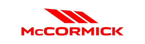
New design for the McCormick logo
Redesigned in 2000, following the acquisition of the historic US brand by the Argo Group, the McCormick logo is modernized after 15 years to blend seamlessly with the new “family feeling” of the McCormick product. The character of the logo has been completely re-styled, taking on greater weight and readability, while the emblem, in solid red without gradations, has been made more concise and dynamic. The goal of the new logo is to visually convey McCormick’s commitment to innovation and technology through a modern and essential graphic appeal. The new design of the McCormick brand maintains however the primary elements of brand recognition, with the well-known three elements sloping from right to left that accompany its prestigious history.